Cloud.typography User Guide
Font Features
The character set panel lets you refine your fonts to include their most sophisticated features.
Character Sets
Hoefler&Co fonts have famously deep character sets, offering features such as small caps, swashes, and multiple figure sets. Traditionally these subtleties have been unavailable on the web, but Cloud.typography gives you the ability to use all of a font’s features online, and deliver them to any browser that supports web fonts.
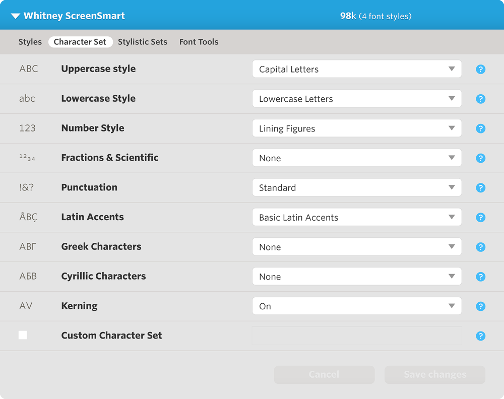
Within each font family’s Character Set panel, you’ll see a list of available features. Using this tool, you’ll be able to choose between stylistic alternatives like Lining Figures or Old-Style Figures. You can also disable any characters that you don’t need, in order to keep your file sizes small.

Font features differ between families, and between styles, but since Cloud.typography subscriptions include access to the entire library, the features available in the Character Set panel will always reflect each font's most advanced edition: Whitney will automatically include Whitney Pro’s small caps, tabular figures, and scientific characters, for example.
Uppercase Style

Capital letters are turned on by default. For font families that offer additional options such as Swash Capitals, choosing this option will render uppercase letters with swashes, in any styles in which swashes are available.
Lowercase Style

Lowercase letters are turned on by default. For font families that offer additional options such as Small Capitals, choosing this option will render lowercase letters as small caps, in any styles in which small caps are available. If you’re only using capitals, turn off the lowercase altogether: not only will it reduce the size of the font files, but Cloud.typography will substitute any capital-specific punctuation that’s included in the font.
Number Style

Many Hoefler&Co font families include multiple figure sets, such as Old-Style Figures to accompany text, Lining Figures that match the size of the capitals, and Tabular Figures for setting columnar data. Cloud.typography even supports the more unusual figure styles in the Hoefler&Co library: add Sentinel and you’ll see its Short-Ranging Figures that bounce between the x-height and the cap height, or Verlag where you’ll find the design’s characteristic Short-Lining Figures that are three-quarters the height of the caps.
Whatever kind of numbers you select, Cloud.typography will automatically serve whatever correctly matched punctuation and monetary symbols exist in the fonts.
Fractions & Scientific

This option is available in fonts that contain full sets of fractions, numerators, denominators, superscripts and subscripts. The Fractions setting enables all of the font’s prebuilt fractions (½, ⅓, ⅔, ¼, ¾, ⅕, ⅖, ⅗, ⅘, ⅙, ⅚, ⅛, ⅜, ⅝, and ⅞), as well as the fraction bar ( ⁄ ). The Superiors & Inferiors option turns on the font’s superscripts and subscripts (¹²³⁴⁵⁶⁷⁸⁹⁰, ₁₂₃₄₅₆₇₈₉₀), and All Available turns on both sets of characters. As with all font features, these characters contribute to a font’s file size, so don’t enable these characters unless you're using them.
Punctuation

Standard punctuation is turned on by default. This set includes the punctuation marks in common grammatical use, plus a couple of important commercial symbols such as @ and ©. Complete will include all the punctuation marks available in this font family.
Latin Accents

Basic Latin Accents are turned on by default, a minimum set that covers the major Western European languages. Extended Latin Accents turns on the full Latin-X set, covering 140 languages throughout the world including all of Central Europe. English Only removes all the accents in a font.
Greek Characters

This option is available in fonts that include the Greek alphabet. If you’re not also using the Latin alphabet, you can disable it under Latin Characters, above.
Cyrillic Characters

Fonts that include the Cyrillic alphabet will offer these options. Choose Basic Russian if your HTML includes Russian text, or Extended Cyrillic to additionally cover Ukrainian, Serbian, Belarusian, Bulgarian, Macedonian, and more than fifty other languages.
Kerning

Kerning tables manage the space between awkward letter pairs, such as ’AV.’ Not all browsers support kerning, but for those that do, enabling this feature will improve the rhythm of your typography at both text and display sizes. As with all font features, kerning tables contribute to a font’s total size in kilobytes.
Ligatures

Ligatures are characters that make a more graceful connection between letterforms that otherwise collide, such as the lowercase f and i. Not all browsers support the automatic substitution of ligatures, but for those that do, enabling this feature will improve the shape and fit of your typography, especially at large sizes.
Support for kerning and ligature substitution differs between browsers, but in most cases requires that you include the CSS declaration text-rendering: optimizeLegibility in your stylesheets. This setting favors quality over speed, and may affect performance on older operating systems or mobile browsers. Consider supporting kerning and ligatures as part of the broader strategy your site uses to address cross-browser support.
Custom Character Set

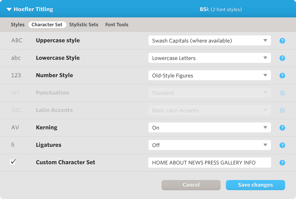
If you only need a few characters in this font, and know exactly what they are, enable this feature and enter the characters here. By limiting the number of characters served, you can significantly reduce the size of your font files. The Custom Character Set option automatically strips duplicate characters, reducing the characters in this example to just ABEFGHILMNOPRSTUWY.
When using a custom character set, options that control the inclusion of certain characters (such as punctuation or accents) will be removed from the interface. The remaining options are those that apply to the appearance of your characters:
